AI & Product Consultant
How to automate the manual work of brand tracking
When a company tracks its brand, somebody has to make a survey mean the same thing in Riga, Vilnius, and Tallinn. That “I would definitely use this” is a different answer from “this is my favourite.” That a chart for 2026 can sit next to a chart for 2024 only when both years actually asked the question. That somebody used to be an analyst with a workbook.
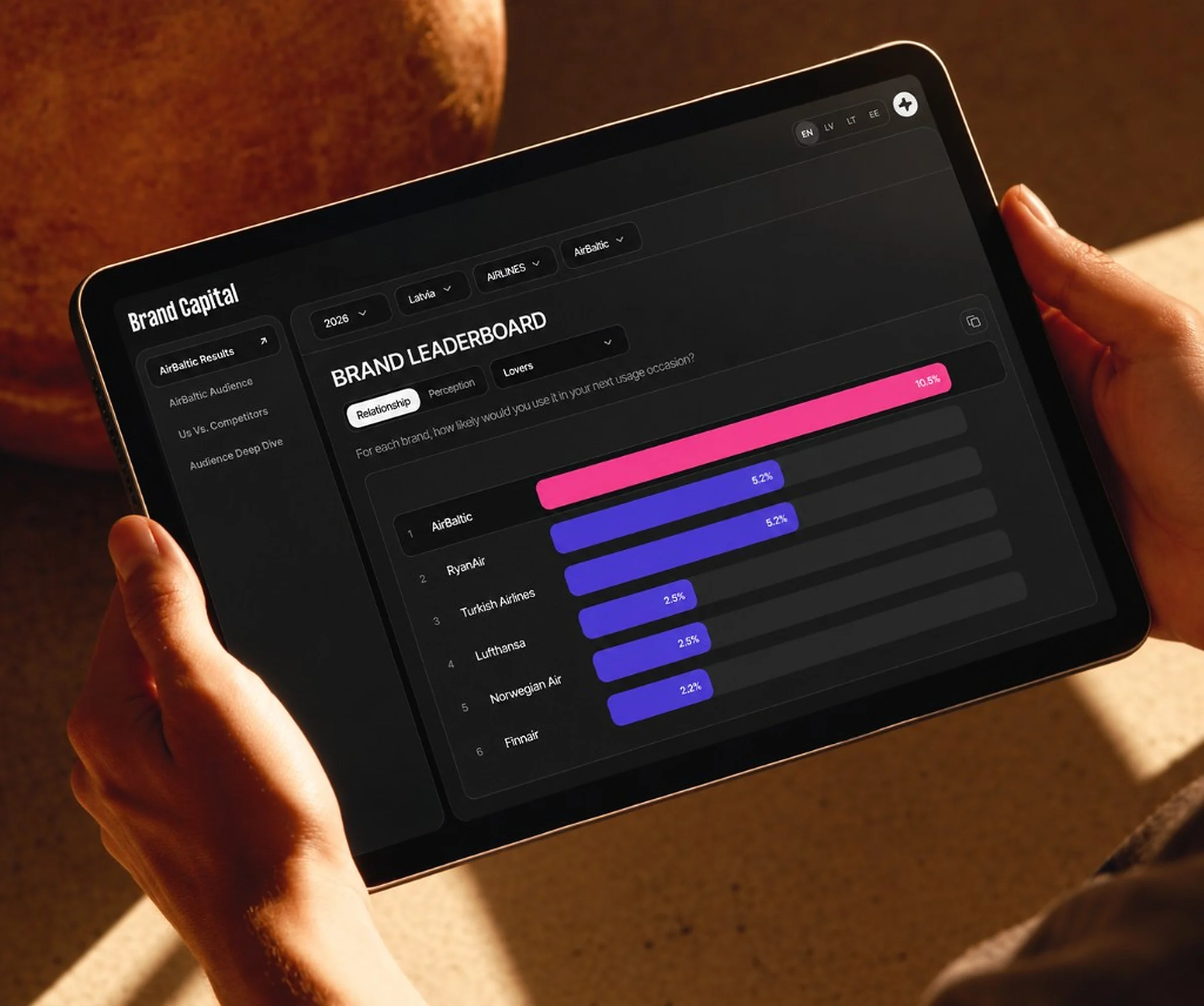
BC Tool is the workspace that does that job. A survey wave arrives as a file. It leaves as four views a brand client or an agency researcher can use without opening the raw data.
Think of it as a reading room for brand tracking. Waves come in. The rules get applied once. The same question can be asked again next year.
- 51
- categories in the survey logic
- 4
- waves, 2023 through 2026, held side by side
- 3
- markets, each with its own geography
The scale of the manual work
A Baltic brand-tracking study is not one table. It is a stack of waves, each with its own column layout, covering Latvia, Lithuania, and Estonia, across 51 categories. Beer. Insurance. Retail. Telecom. Banking. Automobiles. Large state enterprises. The list goes on.
Every wave asks two different kinds of brand question. Relationship is a ladder: strangers, deniers, acquaintances, friends, lovers. Each respondent sits on exactly one rung per brand, and the five shares sum to 100%. Perception is a set of phrases people can tick more than once: quality, value for money, humanness, greenness, and others that come and go by year. Those shares do not sum to 100%, and they must not be read as if they do.
Around that sit the people. Demographics, attitudes, activities, interests, media, cars, money, employer preference, the messages a brand can send. Some questions use a top-two box. Some use a frequency threshold the reader chooses. Some exist only in one country: Latvian municipalities, Lithuanian settlement types, Estonia’s counties, nationality in Latvia and Estonia.
Before the tool, this lived in spreadsheets and static reports. An analyst opened the file, hunted the right columns for that year, applied weights, rebuilt the cuts, and wrote the deck. The next question meant another pass. A different analyst could apply a different rule and still be looking at the same study.
The goal
The aim is self-serve brand analysis for people who are not the person who built the file.
Shorten the path from data to a decision. Make Latvia, Lithuania, and Estonia readable under one set of rules. Let a brand see itself against competitors without commissioning a new cut. Keep one source of truth for performance, so a meeting starts from the same numbers.
The ambition stays inside the study. The tool does not predict the future, write the questionnaire, or collect responses. It makes the study that already exists usable.
The rules live in the product
Brand tracking breaks when each reader invents the method. BC Tool keeps the method in the product and lets the person choose the question.
A relationship share is weighted respondents on that rung, divided by valid respondents. A perception share is the weighted share who selected the phrase. Attitude charts open on the top two boxes. Interest and trust charts open on the top two scores. Activity and media charts wait for a frequency the reader sets. A metric appears in a year comparison only when every selected wave asked it. Likeability stops in 2026. Humor belongs to 2023 and 2024. Relevance belongs to 2025. Distinctiveness and employer brand arrive in 2026. State contribution appears for large state enterprises, because that is the category where the survey asks it.
The reader still decides what to look at. The product decides how the number is made.
A spreadsheet is not a workspace
The source file is the study. It is also the wrong interface for the study.
A wave can shift column names, decimal marks, and which perception suffixes exist. Weights may arrive as Weights_local one year and weight_local the next, with commas where a database expects dots. Country fields differ. A single workbook can answer a question for one analyst this week and refuse to answer the same question for a client next quarter.
Production-ready means the file is checked, mapped, and published. It means a brand client and an agency researcher can open the same wave and see the same rule applied. It means next year’s file can land without rebuilding the screens.
One logic file for every wave
Each year has its own column map. The workspace does not.
Categories keep one order and one set of names, including Latvian, Lithuanian, and Estonian labels. Brands stay tied to those categories. Relationship and perception stay tied to fixed definitions. Audience sections stay tied to the same scales. The database holds the respondents. The logic holds what those columns mean.
That split is what makes 2023 and 2026 comparable. The tables can differ. The questions the reader sees do not, except where the survey itself changed, and then the chip simply is not offered.
Four questions, one context
The sidebar is four ways of asking.
Country, category, brand, and year stay with the person as they move. The survey wording for the selected metric stays on screen. The raw variable names stay off it.
Brand Results
Ranks every brand in the category on the metric in hand, and shows the line across years.
Brand Audience
Takes one brand’s segment, lovers by default, and sets it against everyone in the study. Demographics, attitude, activities, interests, media, and a set of specialist modules: cars, personal finance, employer branding, brand messages.
Us vs. Competitors
Keeps the same audience cuts and puts the focal brand next to the brands around it. The comparison is the audience, not a second copy of the leaderboard.
Audience Deep Dive
Lets a researcher build a group. Pick a question, pick the answers, join conditions with and or or, and read the brand through that slice.
What the tool does on every look
Each step replaces one pass an analyst used to do by hand.
Wave import
An admin loads the workbook for a year. The importer reads that year’s sheet, finds the relationship and perception columns, and stores respondents, brand answers, and attitude answers in that year’s tables. A check runs before a replace. Publishing a wave does not require a new screen.
Weights
One country uses the local weight. More than one country uses the global weight. A brand that was not fielded in a market does not borrow that market’s weight. The chart the reader sees is already weighted.
Relationship and perception
Chips map to the ladder and to the phrases. Relationship chips and perception chips answer different questions, and the screen treats them that way. Changing the chip recalculates the ranking and the trend.
Audience profile
A segment is cut against the full sample, labeled as society. Country-only variables appear only for the countries in view. Scales default to the reading researchers already use, and the reader can open the other codes when the default hides the point.
Competitive audience
The focal brand is the “us.” Competitors are chosen in the same category. The same segment and the same audience section run for each brand, so a difference is a difference in people, not a difference in method.
Custom groups
Deep dive turns a question an analyst would have filtered in Excel into a saved definition: which variable, which codes, and how the conditions combine. The engine runs only on columns it already knows.
Who is allowed in
A brand client is locked to an identity brand. An agency account can move across the catalogue. Admins manage people, access, and imports. Survey results are not edited to suit the chart.
Keeping the numbers honest
Reliability here is a calculation, not a sentence.
Segments on the relationship ladder are mutually exclusive. Perception phrases are not. A chart that summed them would invent a total the survey never collected.
Year comparisons refuse a metric one side does not have. A 2024–2026 view will not draw likeability on one line and leave the other blank. State contribution stays inside the category that measures it.
Labels come from the logic and the datamap, in language, not from the column code. Z01_26_3 never reaches the reader. They see the brand, the question, and the share.
Small rules sit in the same place as the big ones. Comma decimals in a weight still parse. A perception suffix that means “none of these” is never mapped onto quality or value. An empty category, a missing brand, a single-brand category, and an archived wave all have a defined empty state.
The reader can disagree with a finding. They should not have to wonder whether the percentage was built the same way as the one in last quarter’s deck.
Who sees what
The same engine serves two jobs.
Context is stored with the session, so a filter set on Brand Results is still there on Brand Audience. The year control appears when the person has more than one wave. The category control appears when they have a category to choose.
A brand client
Opens on their brand. Category access is a grant. They explore their audience, their competitors, and their trend. They do not browse the rest of the study, and they do not administer it.
An agency account
Explores. Any category, any brand, any of the three countries, within the waves they are allowed. That is the research desk: one workspace instead of a folder of workbooks per client.
Admins
Sit beside both. They create accounts, assign roles, grant categories, load a wave, and publish it. They do not rewrite a respondent to change a result.
From file to published wave
The lifecycle is short on purpose.
Upload. Validate the structure against that year’s map. Resolve categories and brands. Store respondents with both weights. Calculate brand results. Publish. The new wave shows up in the year control and in the trend. Older waves stay. A bad file can be replaced without touching the other years.
Each wave keeps its own tables. 2025 sits in the original set. 2023, 2024, and 2026 sit beside it. The application asks for a year, and the query goes to the right tables. Adding a wave is a configuration and an import, not a redesign of the four views.
What changes for the reader
The study is live as a workspace. A question that used to wait on an analyst is a change of chip, country, brand, or year.
A client can see where their brand sits on the ladder, who the lovers are compared with society, and how that audience differs from competitors. An agency can do that for any brand they are allowed to open, under the same definitions. A new wave does not create a new tool. It extends the one already in use.
The spreadsheet remains the source. It stops being the place where the decision is made.
What this project teaches
Encode the method
Self-serve works when the percentage is defined once. Top-two box, weights, mutually exclusive rungs, and year-specific questions belong in the product. The reader’s freedom is which question to ask.
Show the question
A chip without the survey wording invites people to invent a meaning. The wording stays next to the chart. The variable code stays in the database.
Treat each wave as a dialect
Column layouts change. The workspace should absorb the dialect and refuse comparisons the questionnaire cannot support.
Separate the client from the catalogue
One brand, locked, is a different product from a full catalogue, even when both read the same tables. Permissions are part of the analysis, because the wrong brand on screen is a wrong result.
Keep the raw file backstage
Import, validate, publish. The person in the meeting should meet a labeled chart, a persistent filter, and an empty state when the cut is impossible.
Add waves, not products
Four views and one logic layer are enough to carry 2023 through 2026. The next file should land in that layer.